


Calculating the earnings Gini coefficient with survey data from the Quarterly Labour Force Survey (QLFS) may lead to an underestimation of inequality. When one compares earnings in the tax assessments data to those in the QLFS, it appears that the earnings of employees in the QLFS are underreported. Benefits and annual bonuses contribute substantially to the gap. In the case of self-employment incomes, the top earnings in the QLFS are also underreported, but the tax data seems to miss many mid- and low-income earners.
Introduction
Many of the key policy questions facing South Africa require accurate data. One of the recurring debates in this context is whether survey information can be trusted. For instance, in the debates surrounding the setting of the national minimum wage, there were heated discussions about the likely impact of choosing different minimum-wage levels (Finn 2015, Seekings & Nattrass 2015, Isaacs 2016). The main evidence used was the distribution of earnings in the Quarterly Labour Force Surveys (QLFS).
However, there are many questions about the accuracy of that information. A number of authors have suggested that the information on earnings should be cross-checked against more reliable external data. In a recent REDI3x3 working paper (Wittenberg 2017) this was done: it compared QLFS survey data and tax data for the 2011 tax year. The answer, unsurprisingly, turned out to be somewhat complicated.
Why would tax data and survey data differ?
The SARS tax data comprised a sample of tax assessments together with some aggregated information about the 472 individuals with highest taxable incomes. The data was made available via REDI3x3 and has previously been used in research on wealth inequality (Orthofer 2016). One of the limitations of the SARS dataset is that it only covers individuals who have filed tax returns. The threshold for compulsory filing for PAYE earners was R120 000, so people with relatively low incomes will be absent from the tax data.
There are a number of other salient differences. The QLFS only asks for income from the ‘main job’, whereas the SARS data typically cover all sources of income. Furthermore, the QLFS asks different questions of wage earners and the self-employed – and respondents are forced to choose one or the other category. As a result, if wage earners generate any additional income by being self-employed on the side, this will not be reported in the QLFS data.
What other sorts of biases might we expect in these different datasets? Firstly there is likely to be a marked difference in coverage. The QLFS’s survey samples usually do not include a lot of high income earners because they make up a very small proportion of the population. In addition, many people who earn high incomes may opt not to cooperate with the survey organisation (Statistics SA). Even if they agreed to be surveyed they would often be reluctant to disclose their incomes. In contrast, in the case of the tax authorities (SARS), they have much less choice since there are large penalties for non-cooperation or non-disclosure.
Even for the individuals whose incomes are reflected in the QLFS, there may be problems in the responses regarding earnings in particular.
- One might expect that respondents would find it easier to recall what their ‘take-home pay’ is than what the earnings question is explicitly about: ‘gross pay’ (i.e. before tax). Thus, one might expect that individuals might not accurately add back the tax and thus underestimate their earnings.
- Many indebted individuals may be subject to garnishee orders, so that their ‘take-home pay’ is even smaller than their after-tax income.
- Many employment packages come with company benefits (pension and medical aid) which the individual may not recognise as part of their ‘gross earnings’.
- There may be annual bonuses or other lump-sum payments which may not be fully accounted for. On all of these matters we would expect the tax system to provide more accurate information, since the data is supplied by the employer.
Things become more difficult in the case where income is derived from self-employment. For self-employed persons (e.g. an owner-operator of a small business or professional service) the QLFS surveys try to obtain earnings after expenses but before tax. This requires respondents to be able to separate their business expenses from their personal expenses. This is likely to be difficult, particularly if their income fluctuates – and more so for small and informal operators. In contrast, when income has to be declared to the income tax authority, there are clear rules as to what can and cannot be claimed. Nevertheless, there is a strong incentive to under-report income or to over-claim deductions, since this directly affects one’s after-tax income. We would therefore expect problems (in this case the underreporting of net earnings) to occur in the tax data also.
Comparing earnings from the two data sources
Because both the tax-assessments data and the QLFS data are anonymised, one cannot find the same individuals in the two datasets and compare the answers they gave to StatsSA with those presented to SARS. Indeed, given the fact that both datasets are samples, there is no guarantee that they will even overlap in terms of membership. Nonetheless, both are supposed to give a reliable picture of national earnings, at least above the compulsory tax-filing threshold.
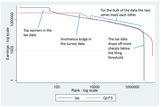
We will compare them through a simple thought experiment – a reverse ‘Pen’s parade’. We sort the population (as represented by either dataset) from the richest to the poorest person and compare the two data sources in terms of what they suggest about the relative earnings of individuals. The resulting picture for the ‘wage earners’ is given in Figure 1, which shows the rand earnings (measured in logs) for the ranked persons (also measured in logs). Measurement in logs means that the scale gets progressively compressed at higher values.
Starting from the left-hand side of the diagram, we see that the richest wage earners in the tax data have markedly higher income than the ones in the QLFS. The gap between the two lines may look small on the diagram. However, measuring earnings in logs masks the fact that the differences are huge. The highest earnings in the tax data exceed R10 million per annum (the solid line) whereas the corresponding QLFS figure is R4.8 million (the dashed red line). Moving to the right in the diagram, we see that, while at first the earnings from tax data remain significantly higher than those from QLFS data, from about the 100th person the QLFS numbers are above the tax numbers. This produces a puzzling bulge of high earners in the QLFS data which goes on up to rank 10 000. Many of these data points in the QLFS are suspect and at least some of them will be imputed values, to compensate for the incomes of individuals who refused to answer.
What is quite important, is that in most cases the two series actually track each other remarkably, as indicated in the right-hand portion of the diagram. From around rank 10 000 to around rank 3 million the two series are in spitting distance of each other. After that point the earnings recorded in the tax assessments data fizzle out, because by then we are well below the compulsory filing threshold for income tax.
Figure 1. Earnings for wage earners by rank: comparing tax data
and QLFS data (ranking earners from richest to poorest)
Next we have a closer look at the relationship between the two lines, but now with a regular and not with a log scale. As a result the first few hundred observations are not visible. Figure 2 shows the size of the gap between the two series, i.e. the premium in earnings obtained from tax data over QLFS-based earnings. Although the two series move together, there is an appreciable gap between them. The size of the gap is indicated by the solid line for regular income (i.e. PAYE earnings). On average, in their tax returns people report around 20% more in earnings than what they report in the QLFS survey.
The figure also shows the gap between the QLFS’s income and other types of income in the tax data. ‘Cash income’ (the dashed red line) adds commissions, annual lump sums, director’s income and a variety of other cash payments to regular (PAYE) income. The final series (the dashed green line) also adds benefits (particularly pension and medical aid). It shows that, when we add other cash income and benefits, the average gap between earnings from tax data and from QLFS data is in excess of 40% in most cases. This mismatch is larger higher up in the earnings distribution, i.e. towards the left-hand side of the diagram (with the exception of the odd bulge right on the left). This is because higher earners will often also have expense accounts and better fringe benefits. Although these are part of ‘earnings’, they are unlikely to be reported in the QLFS.
Figure 2. Premium in earnings from tax data
over earnings from QLFS data for wage earners

The evidence thus suggests that wage earners in the QLFS do, on the whole, report something like ‘gross income’, but they underestimate this considerably. In particular, in the QLFS survey they under-report parts of their earnings package (like annual bonuses and benefits) that may be less immediately visible to them.
For self-employed persons the situation is markedly different. Figure 3 shows the premium. For the richest 54 000 self-employed individuals, the earnings reported to SARS exceed those reported in the QLFS survey – initially by more than 100%. However, as one moves to the right in the diagram, below an annual income of R600 000 the self-employment income reported to the QLFS exceeds that reported to SARS, again by quite a lot (there is a sizeable negative premium). And there are many individuals in this range – over 350 000 in both datasets.
Figure 3. Premium in earnings from tax data over earnings
from QLFS data for self-employed persons
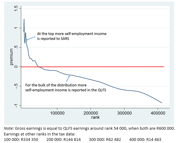
There are two possible explanations for the mismatch. Perhaps the people surveyed in the QLFS wanted to impress the interviewers with incomes that they didn’t really earn. Or, these individuals felt that they were ‘under the radar’ of SARS, so they didn’t need to fully disclose their income to SARS. It seems plausible that artisans, mechanics or small contractors that make in the region of R10 000 to R40 000 per month through cash-only deals might be willing to disclose this to a StatsSA survey, but not to SARS.
Conclusion: Implications for the measurement of poverty and inequality
If wage income is underreported in the QLFS, as our findings suggest, then poverty among formal-sector workers will be overestimated when using QLFS earnings data. On the other hand, given the structure of the under-reporting, with bigger gaps near the top of the distribution, inequality is likely to be underestimated.
This is not only of technical interest. It is most relevant for the monitoring of social and economic policies directed at the reduction of poverty and inequality. If we ‘correct’ QLFS earnings for the underreporting, the Gini coefficient for earnings inequality goes up by three percentage points, i.e. from approximately 0.59 to 0.62. That is a sizable increase.
Overall, the analysis reveals problems with survey data on earnings – but not of a magnitude to make them unusable. In addition, and interestingly enough, it shows that the tax data on earnings also are subject to reporting biases, though of a different kind. Analysts need to be quite careful when using either of these sources in analysing earnings patterns.
Written by Martin Wittenberg, Professor and Director: Data First, University of Cape Town. This article was first published on Econ3x3.
EMAIL THIS ARTICLE SAVE THIS ARTICLE ARTICLE ENQUIRY FEEDBACK
To subscribe email subscriptions@creamermedia.co.za or click here
To advertise email advertising@creamermedia.co.za or click here